
Design system
from scratch
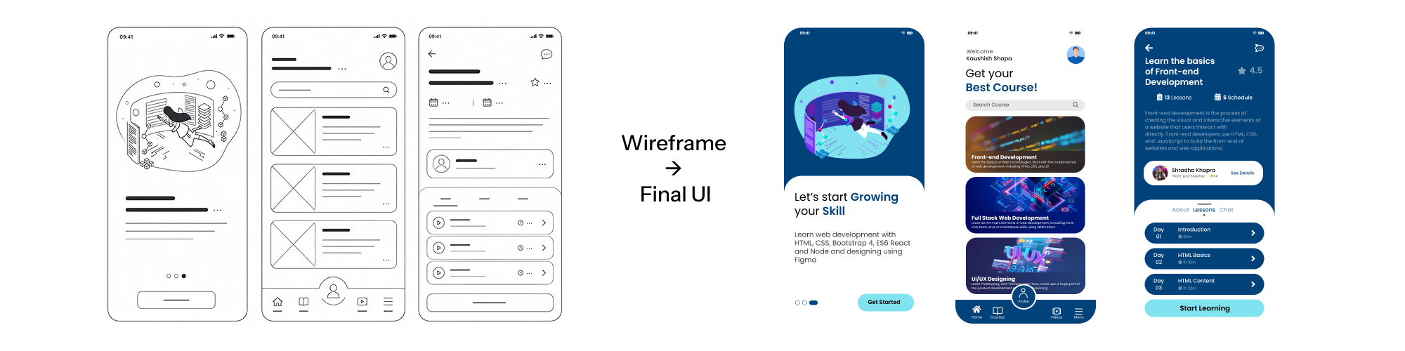
Wireframes first to define layout and hierarchy. Then a reusable library of buttons, cards, navigation, and forms created a lightweight design system for building new screens faster.
UI/UX and graphic design from Birgunj, Nepal. I design interfaces people can actually use — then hand developers files they can actually build.

I'm Kaushal — a designer from Birgunj who learned the front end first, so I know exactly what happens to a layout after the handoff.
I work across UI/UX and graphic design in Birgunj, Nepal: Figma wireframes, component libraries, e-commerce flows, logo and brand marks, and the WordPress websites they end up living inside. Most of my day is Figma, but I also build in WordPress and Elementor, write the HTML and CSS when it's faster, and handle the on-page SEO so the work is actually findable once it's live.
I taught frontend development to beginners for six months in 2024. That's the part that changed how I design — spending that long explaining how a layout turns into code makes you stop drawing things that can't be built. Now I lead design, development and marketing tasks at Pinned Agency, and run my own studio, Codexdesign, alongside it.
Wireframes first to define layout and hierarchy. Then a reusable library of buttons, cards, navigation, and forms created a lightweight design system for building new screens faster.
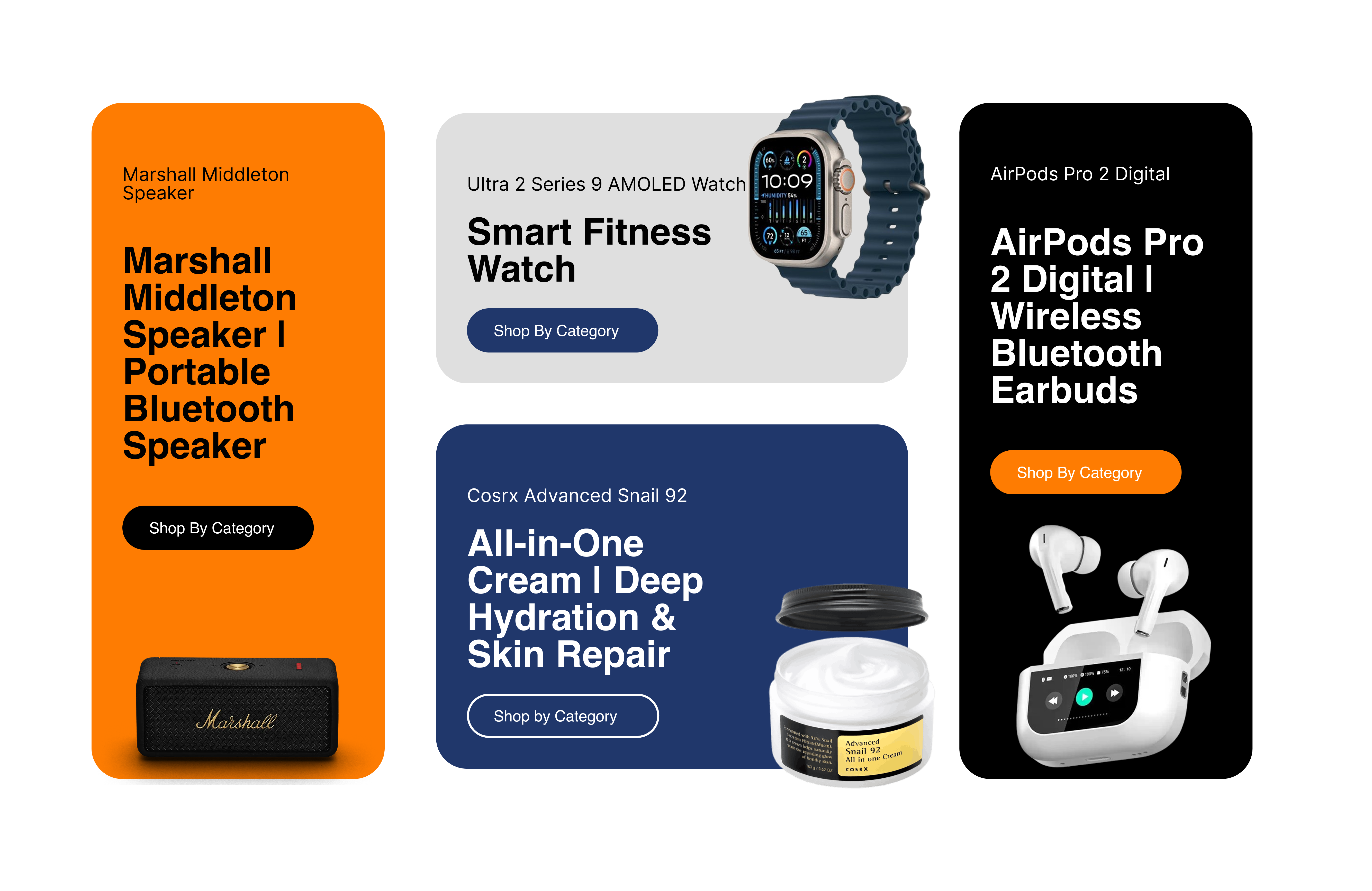
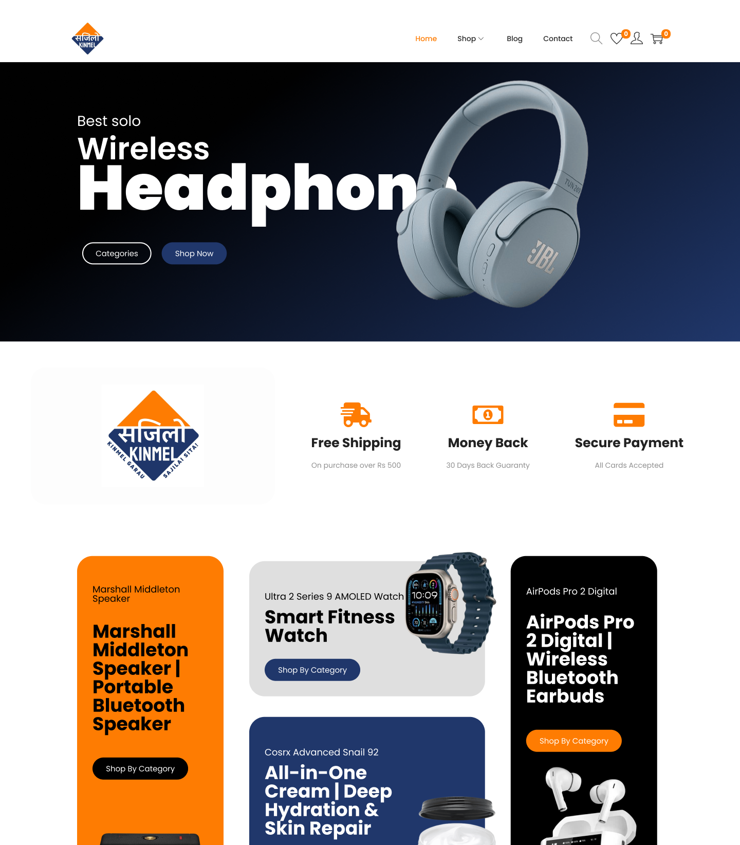
Product listing, product detail, checkout. The whole path a shopper takes, designed so the visual hierarchy does the pushing instead of the copy. Consistent styling across pages so the site holds together as you move through it.
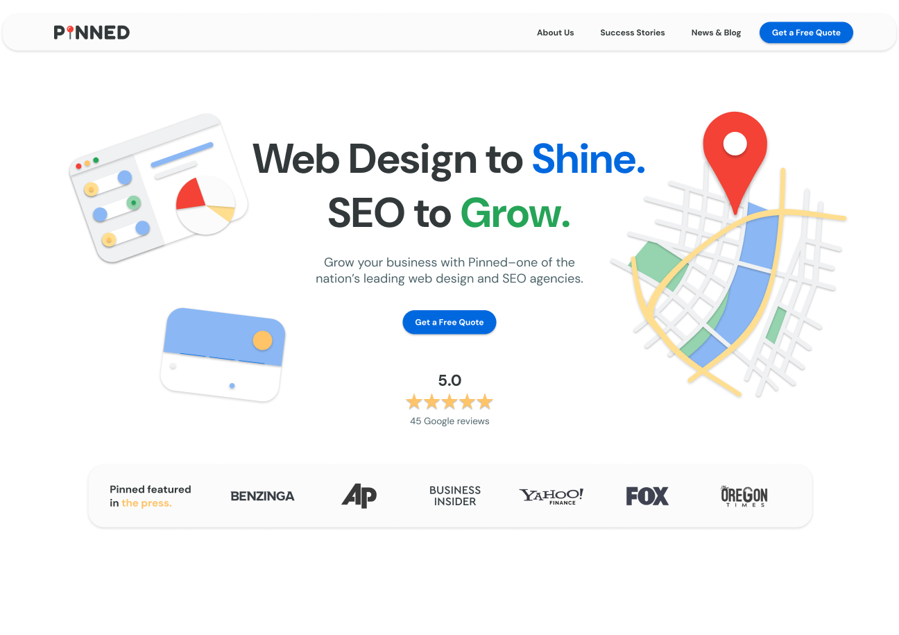
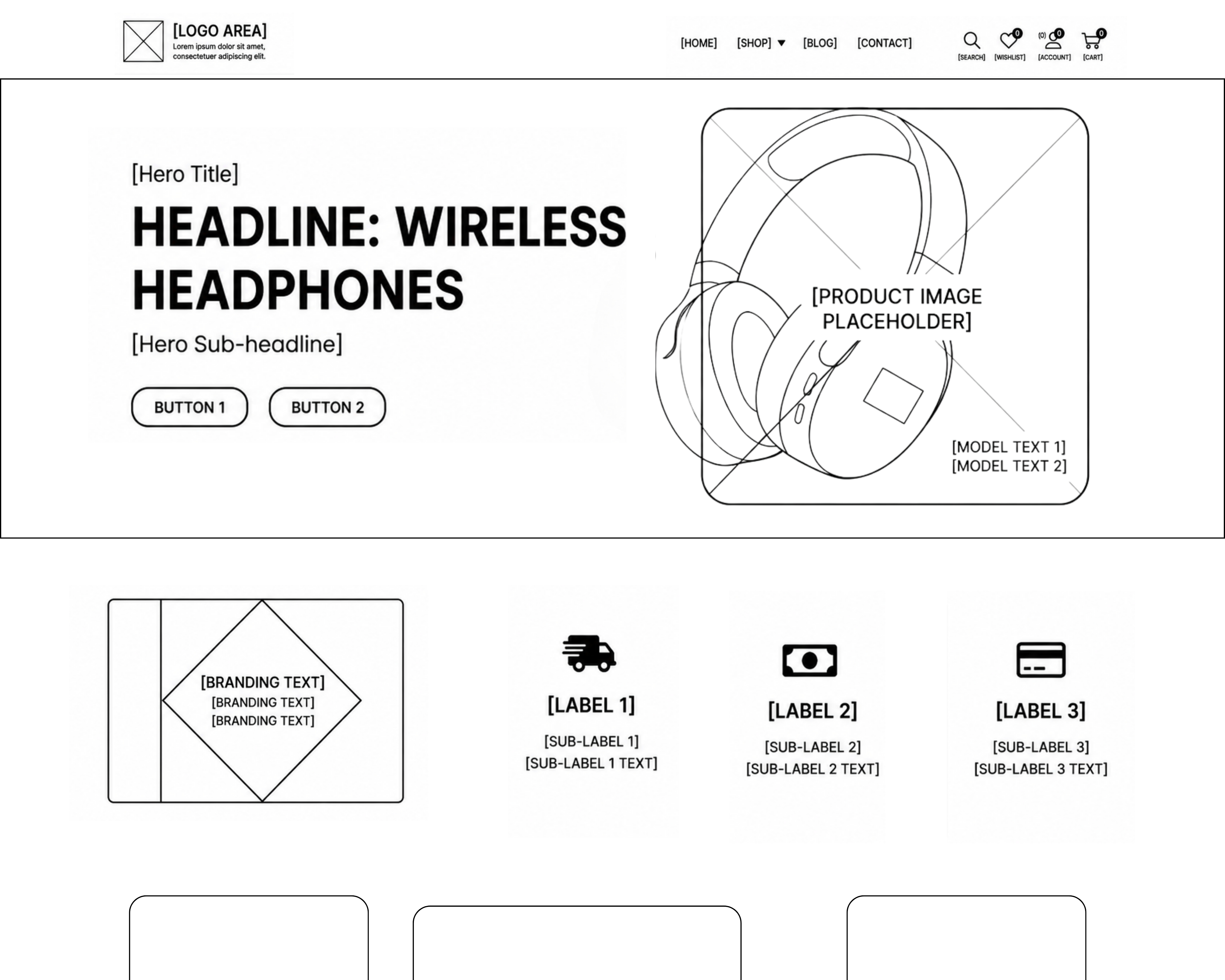
Homepage through key content pages, composed for clarity and made with responsiveness in mind from the start — so the layout survived the move into development instead of being renegotiated in it.
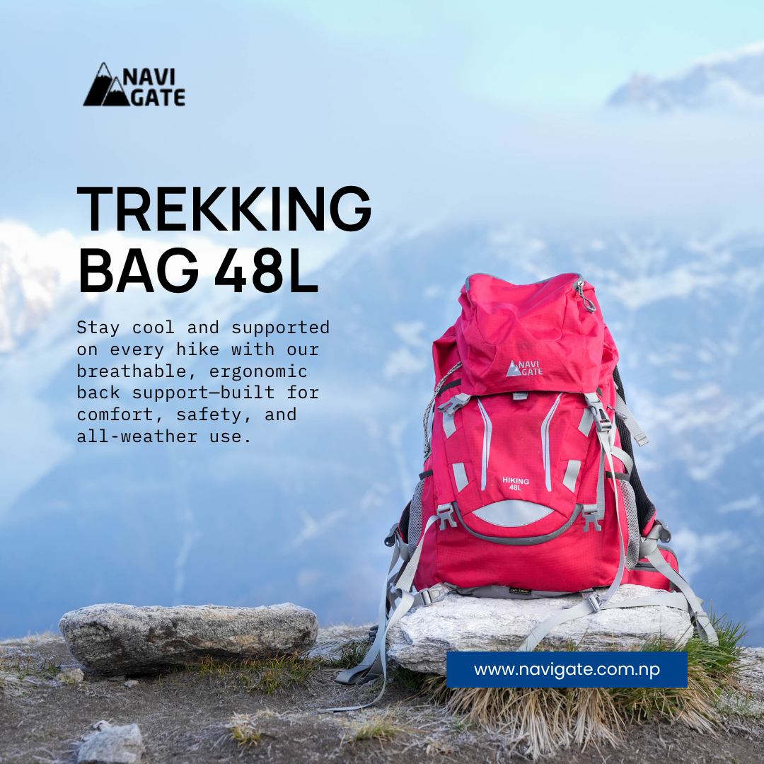
Keyword research across outdoor apparel — down jackets, waterproof shells, trekking gear — then titles, headings, product categories and page structure rewritten around it. Google Analytics and Search Console to see whether any of it moved.
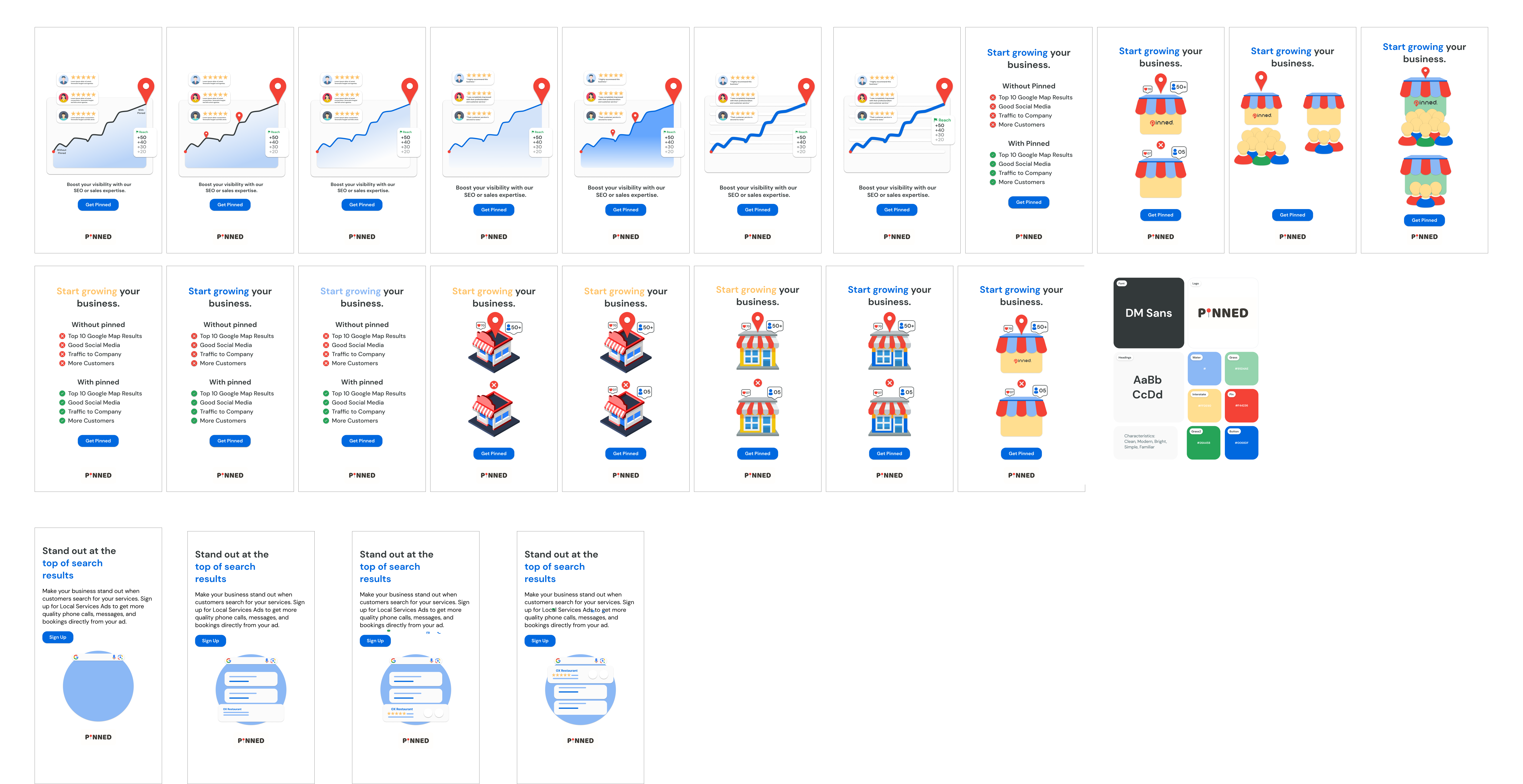
Pinned needed a compelling way to communicate their core value—boosting local business visibility—but previous marketing efforts lacked a cohesive, engaging visual punch. The brief was to design a high-converting digital marketing campaign, but the real challenge was breaking down complex SEO and local ad services into an instantly digestible visual language that small business owners could trust.
I started by mapping out the messaging hierarchy before touching any colors or illustrations. The job at this stage was to determine how to quickly communicate ROI. I focused on structuring clear "Before/After" scenarios and tangible benefits—like climbing to the top 10 Google Map results and driving more traffic—so that the final high-fidelity designs had a strong, persuasive foundation to build upon.
Instead of designing isolated graphics, I developed a reusable visual language for the campaign. As shown in image, I established a clean typography system using DM Sans and a defined color palette that balanced professional, trust-building blues with clear success (green) and alert (red) states. This ensured every campaign asset felt like it belonged to the same family.
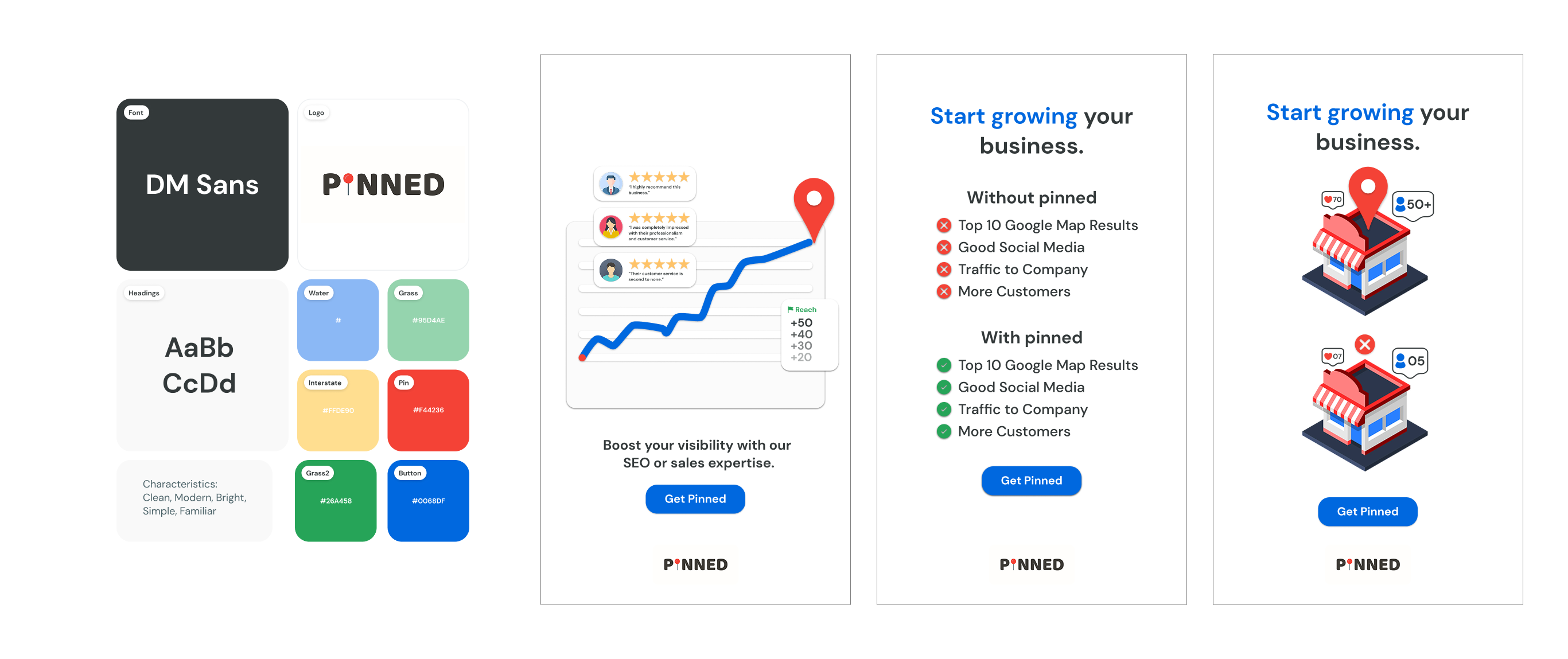
Small business owners are busy, so the campaign needed to show, not just tell. I designed custom isometric graphics—such as storefronts with engagement metrics, rising line charts, and Google Search result mockups—to visually represent what "getting Pinned" actually looks like. Using clear visual comparisons ("Without pinned" vs. "With pinned") made the choice obvious for the user.
Rather than overwhelming users with dense paragraphs about SEO algorithms, I assembled the components into clean, lightweight, mobile-optimized screens. By organizing the path around what users actually care about—getting more quality phone calls, messages, and direct bookings—and anchoring each layout with a bold "Get Pinned" call-to-action, the campaign seamlessly guided users from awareness to conversion.
Wireframes, a reusable component library and a lightweight design system the team could design against.
Listing pages, product detail views and a checkout flow shaped so browsing leads naturally to buying.
Full visual layout from homepage to key content pages, drawn with the build in mind.
On-page structure, titles and categories rebuilt around real search demand, then measured.
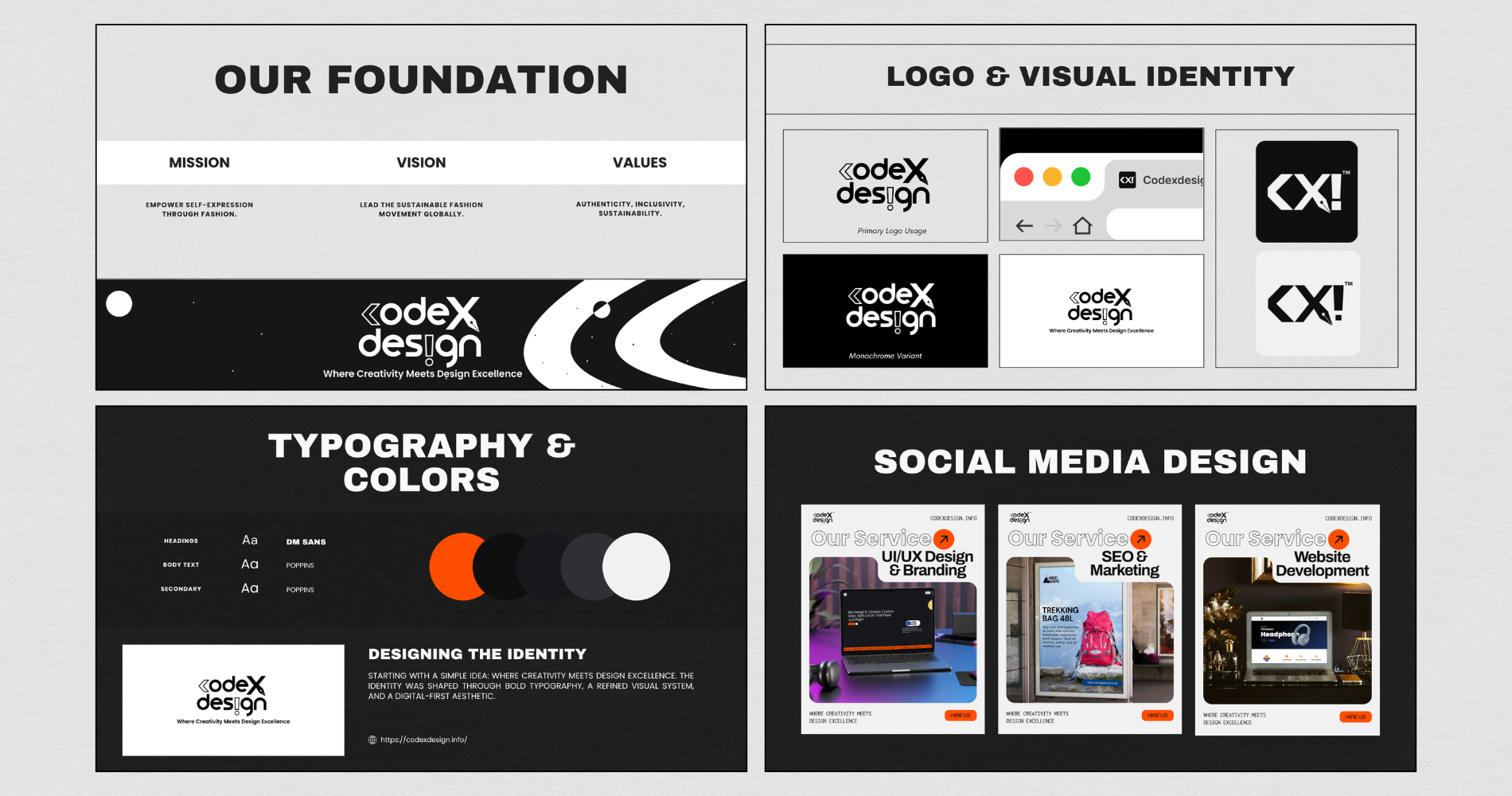
An Instagram identity for a handmade brand. Built simple on purpose — it had to stay legible as a 32px profile photo and as a watermark sitting over busy product shots.
Feed posts and stories drawn from one set of rules, so a campaign stays recognisable as it changes shape across formats.
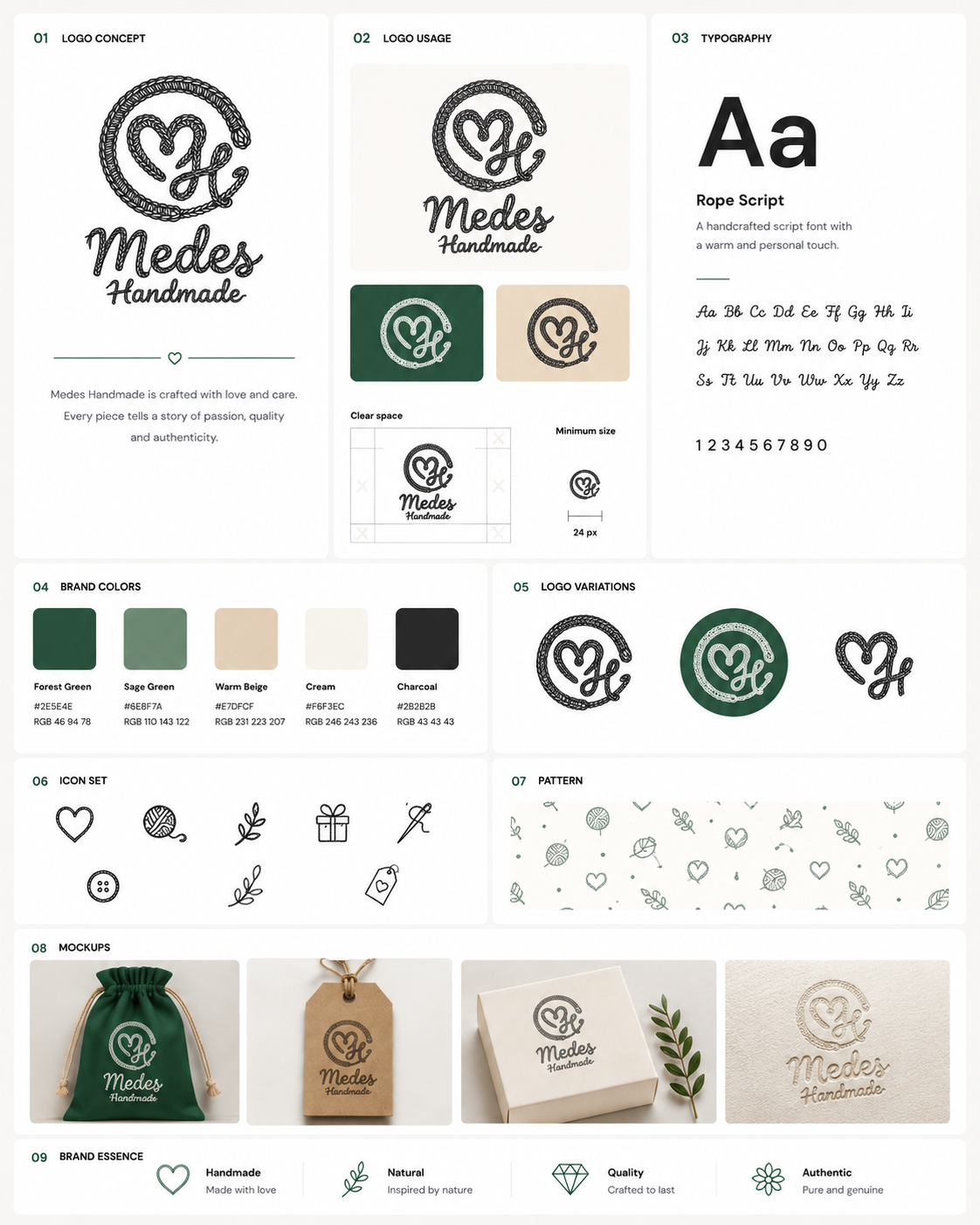
An Instagram identity for a handmade brand. Built simple on purpose — it had to stay legible as a 32px profile photo and as a watermark sitting over busy product shots.
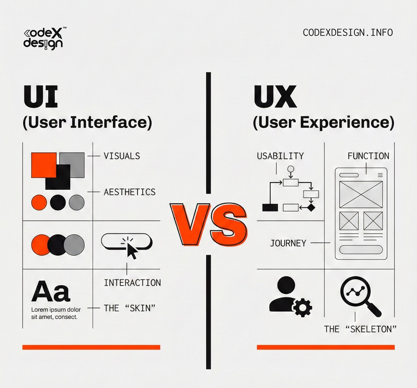
UI/UX design in Figma: wireframes, user flows and high-fidelity screens, with interactive prototypes when a flow needs testing before it gets built.
A component library and the rules around it: type scale, colour roles, spacing. Sized so your team will actually use it.
Logo design and brand identity: marks built to survive small sizes and busy backgrounds, plus the pieces that keep a brand recognisable everywhere it appears.
WordPress and Elementor web design carried through to a live, responsive site — or handed to your developers with the details already resolved.
On-page SEO: keyword research, page titles, headings and site structure, so the work you paid to design is findable once it ships.
Social media design: feed posts, stories and campaign creatives made as a set, adapted across formats without losing the thread.
What the page has to do, who it's for, and what counts as it working. Written down before anything is drawn.
Greyboxes only. Layout, structure and hierarchy settled while changing them is still free.
Components, type scale and colour roles defined once, so every screen after this one is assembly rather than invention.
The real thing: states, spacing, responsive behaviour. Prototyped where a flow needs to be felt, not described.
Named layers, resolved edge cases, and answers to the questions developers are about to ask. Or I build it myself.
On-page SEO, analytics and Search Console once it's live — then changes based on what people actually do.
If someone has to work out what a screen wants from them, the layout has failed. Hierarchy first, decoration last.
I've taught people to write the code. So I don't draw things that can't be built, and I resolve the edge cases before handoff rather than after.
One good button, reused, beats twelve good buttons. Systems are how small teams ship at a size they shouldn't be able to.
Add a short quote here about how the design handoff went — the more specific, the more it lands.
Add a second quote here — ideally one that mentions a result, a deadline met, or a problem solved.
Add a third quote here — a client or teammate describing what working with you was like day to day.
The top design honour of the internship, awarded for leading UI/UX on the main project: wireframes, component library and design system.
Certificate covering campaign strategy, on-page optimisation and web design fundamentals.
Certificate in interface and experience design workflows in Figma — components, prototyping and handoff.
Certificate following a four-month intensive online course in frontend development.
Full-time or part-time UI/UX and graphic design roles, remote or based in Nepal. I'm currently working remotely with a US agency, so I'm comfortable across time zones. Freelance project work runs through Codexdesign.
Both, depending on what you need. I design in Figma and can build the live site in WordPress and Elementor, or write the HTML, CSS and Tailwind directly. If you have developers, I hand off files with named layers, defined states and the responsive behaviour already decided.
A conversation about what the page or product needs to do, and what would count as it working. Then wireframes — always before visual design, so we're arguing about structure while it's cheap to change.
Yes — keyword research, page titles, headings, content structure, and setup in Google Analytics and Search Console. I do this at Pinned Agency and did it for Navigate®, so it's part of how I think about page structure, not a bolt-on afterwards.
Yes. Logo marks, visual identity and social content design. I approach marks practically — most of them spend their life at profile-picture size, so legibility small comes before cleverness large.
Email is fastest — hellokaushalsroy@gmail.com. WhatsApp or a call on +977 9828332275 also works, and I'm reachable on Instagram at @kaushalsroy. I'm on Nepal time, UTC+5:45.
worth using
Birgunj, Nepal
Local time —:—